For this page assignment, we were tasked with demonstrating cropping and resizing, creation of a gradient header, a vignette, restoration of a damaged photo, matting of an engraving, and colorizing a black and white photo.
Header and Vignette
There are a number of twiddly bits of code to create gradients in various directions, number of color stops, and transformations. I'm not a big fan of most of them. For this assignment, I chose a simple left-right gradient that would work with the vignette.
There are several methods for creating a vignette; I chose to use the marquee tool with a widely feathered edge. This gave me the most options for adjusting it. In the end, though, I kept it pretty simple.
Photo Restoration
Photoshop has a number of useful tools for restoration of damaged photos. In the example below, I first changed the image to black and white and played with the RGB balance. I then zoomed in on the image and worked across and down methodically, removing scratches and spots. I used the zoom in/out function quite a bit to ensure that I knew what I was properly distinguising between damage and legitimate markings on objects.
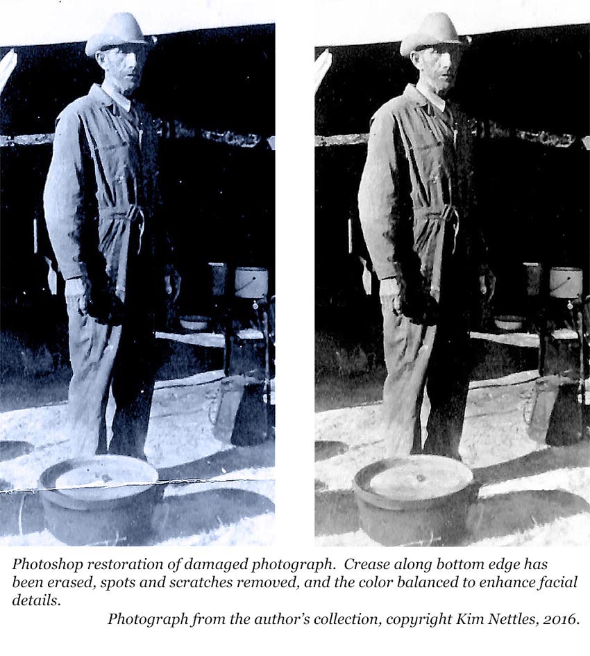
To repair the crease at the bottom, I used the healing brush tool to carefully recreate the original image. The cover of the dutch oven gave me fits for a bit until I realized that there is a shadow falling over it that runs along the crease mark. The dark mark in the center of the lid is a fitting for lifting the lid, not damage.
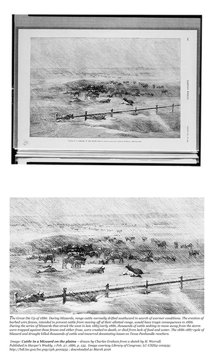
Matting and engraving
For my engraving, I went to the Library of Congress and retireved a .tiff of an illustration of The Great Die-Up of 1866. The engraving itself is undamaged, so I was able to go straight into other adjustments for clarity and to correct the angle. Once I was happy with the appearance, I cropped it down to focus more tightly on the cattle and then placed over a new canvas that was approppriately sized to create a mat for the finished piece.
Before and after:
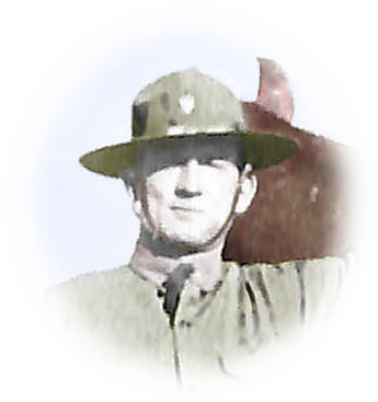
Colorizing a Black and White Photo
I had anticipated that colorizing would be enjoyable, but I had not fully realized its value as an analysis process. By the time I completed work on my image, I had a few more research questions and a new appreciation for the McClellan saddle.
The image is of Vernon Hofacket after he left the JA Ranch and joined the Army in the early 1920's. After scanning the original photography, I adjusted the image for clarity and then set about my color work. For my palette, I drew color samples from high-quality photographys of similar artifacts from the era. I was most intimidated by the skin tones and found several palettes on the web that served as a good starting point.
After vacillating between multiply and overaly (with a few side trips into color dodge and burn), I found overlay to be the most useful tool for my work. I found that the most satisfactory results required judicious use of multiple colors, rather than relying solely on the multiply tool. The holster, for example, has three shades sampled from an image of a 1920 holster. A separate color was used for the saddle and reins. The horse was overlaid with a bay color overall, and then highlighted with a lighter shade and a feather touch.
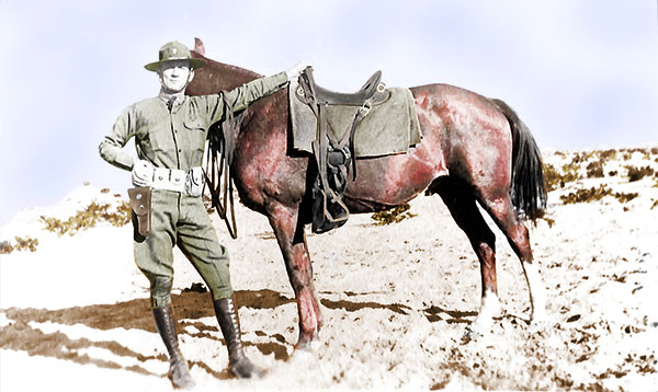
The saddle drove me nuts. The image quality was very poor in the area just behind the cantle (seat) and I assumed at first that it was a piece of gear attached. Once I figured out that it was part of the McClellan saddle design, I was able to properly interpret what I was seeing and color it in appropriately.
I'm least satisfied with the sky and ground. No matter what I do, it just looks fake; and, yikes, the yellow background of the web page turns the sky even bluer. The next time I work on an image that involves landscape, I'll do more in-depth study of the techniques for doing this.